
-
 Monday, 22 August 2016
-
 0 Comments


1. PicMonkey

PicMonkey is a great online photo editor tool. Not only Edit but Touch Up, Design, and Collage are also available in this app.
Functions in photo editing are many. In each feature, you’ll be amazed at a lot of effects for you to choose from. Moreover, you can add text, stickers, or frames to your photo. Especially, there’s a button on the bar below the photo that allows you to see the before and after effect. At Save step, it also offers you different choices for the photo. You can save in either JPG or PNG format, rename the photo if you like, pick a quality level, enter dimensions, and save to computer or Dropbox.
A big plus for this tool is that it offers many features but still very easy to use. The tool bar is put on the left with features organized in a neat and clean order. So it won’t take you much effort to get used to PicMonkey.
2. Fotor

Fotor has an interface close to PicMonkey. It also has many effects that you can apply to your photo. Besides Photo Editing, you can make photo collage and even create your own design. A different point in Fotor is that you can import many photos at the same time and they will appear on the right side. This is quite convenient for you just choose all the photos you want to edit once and then take turn to edit one by one.
Similarly, you can rename the photo, choose which format to save as JPG or PNG, and pick the quality from Normal to Highest. If you don’t like to store photo in Computer, you can save it to Dropbox.
3. iPiccy

Like PicMonkey, iPiccy is a feature-rich and user-friendly editor tool. It has hundreds of effects from basic to advanced. That said, the basics are just so enough to make a beautiful photo.
On the top is the bar listing main functions, namely: Basic Editor, Photo Effects, Retouch, Blender, Painter, Frames, Textures, and Save button. Under each function is a set of different features appearing on the left bar.
Piccy allows you to rename your photo, choose file format as JPG or PNG, and choose the quality by percent. It also enables you to share photo directly to Facebook.
4. Canva Photo Editor

If you’re overwhelmed by so many filters and effects that you’re not sure which to pick, try Canva. The effects are not so many like they are in PicMonkey, Fotor or iPiccy, but basic core features are all available.
Canva is well known as a great place for simple graphic designs. Recently, a new service was launched as an online photo editor. My first impression of this tool is that it’s like the web version of Instagram which is very easy and fun to use. You can quickly edit photo with no apps or plugins required. First, upload your photo, then start to edit it with basic effects, including Filter with various layers, Adjust the brightness, contrast and saturation, Crop by ratio or by your custom size , Resize, Rotate, and Flip. When all done, click Download to save the photos in PNG format.
To conclude
I’ve tried several different photo editors and these are the ones that I like the most. They are free, feature-rich, but on top of that, they are very easy to use so you will have fun enhancing your photos.
There are still many cool tools I haven’t tried yet, so if you are using other tools that you think they should be suggested to other users, leave a comment and I’ll be happy to update my list.

DirectoryEngine

DirectoryEngine is a complete solution for a fully responsive WordPress theme and is suitable for any directory types. The theme has entered its stable development stage with all core features available.
You’re ready to make money creating different price packages and utilizing multiple payment gateways from global ones like PayPal, Stripe to local such as Pin, PayFast, Paymill, etc. What’s more? Visual Composer is integrated which makes it so easy for you to customize the theme. Front-end listing submission, review and rating system, and awesome color schemes are also supported features in DirectoryEngine.
Easy to Setup
Monetization plans
DirectoryEngine theme supports different price packages which are easily created in the back-end.Step 1: Set up payment plans

Step 2: Set up payment gateways
Enable the payment gateways you want for your directory site and fill in required information.

Front-end customization mode
With premium Visual Composer integrated, you’re able to make changes to your theme and see live updates right in the front-end. Moreover, built-in content blocks and customizable widgets make it even easier for you to simply drag & drop or add any contents you wish.
View Live Demo to get the best experience.
DirectoryEngine is a complete directory WordPress theme to help you build your own listing website. Its flexible design is made to suit any kind of business directory or place listing. This is the theme you’ll ever need to increase more traffic and make money from your online business.
-
Sunday, 21 August 2016
-
0 Comments

While marketing strategies, such as SEO, Google ads, social marketing, try to drive more traffic to your website, conversion optimization plans play an important role in turning your site visitors into customers.
To improve conversion rate on your website requires thorough research about user behavior when visitors explore your website. That said, there are tactics that encourage more and more visitors to become your loyal customers. This article will outline 10 tips you can carry out to optimize conversion rate.
1. A/B testing

A/B testing (split testing) is the method that you create different versions of your page with some tweaks and test to see which works better with higher conversion rates. Due to the fact that your audience is unique, what you think works well might turn to be a bad choice when it comes to your audience. Therefore, the best way to figure out what works well and what needs further improvement is to do A/B testing.
To split testing, you can use Google Content Experiments of Google Analytics which is a free and easy to use tool.
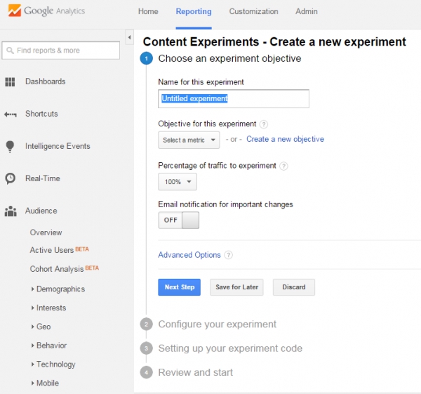
First, set up your goal and the percentage of traffic you want to send to experiment. Then input the destination URLs of the original page you want to test and of other variations. You will be given an experiment code to add to your original page. When all is setup, you’re ready to run start the testing and see which is performing better.
2. Create urgency for immediate action
Urgency notifications like “There’re only 3 items left” or “The last day to get the discount” have proved to be effective in urging people to buy right away. When there’s a specific deadline or scarcity for special offers, people will tend not to delay but take the buying process immediately for they don’t want to miss out the chance.
However, be careful to choose a proper type of urgency depending on your products or services. For example, if you offer digital products which never run out of stock, using the statement saying something like “5 items left in stock” is not gonna work and can cause reverse effect to your business.
3. Show the benefits

A landing page that sells has not only good design but also excellent contents. Contents are what your customers will read and are your opportunity to persuade people why they should choose your products over the ones from other competitors. So, what are the key takeaways to create great contents for your website? Here are some:
- Show value proposition: What is value proposition? It is a statement of value you will give your customers. It convinces users how your products better solve and improve customers’ problems than similar offerings. Having a specific value proposition will help differentiate your company from other competitors, show your uniqueness and strengths. Also, visitors will find it easier to understand your company, your products, and to determine how your offerings will help them improve the situations.
- Great copy to make it easy to read: Once you have set up your value proposition, deliver it in a way that all visitors can read it and understand easily. This is very important as they are your potential customers and the target you want to communicate with. If your messages are written in terminological terms that only economy majored people can understand, you have failed in delivering your values to a lot of potential customers.
- More benefits, fewer features: Most importantly, people buy why you do it, not what you do it. This is consistent with the value proposition focus. Your customers are more interested in the benefits your products offer than the features. Let’s say one of your item has 20 features, many of which are similar to other products in the market but some of which are different. These don’t make much sense until you take advantage of the unique features to talk about the benefits your customers will get using your product with such advancing functionalities.
4. Use Call To Action
Each page on your website should be designed to serve a specific purpose and navigate users towards a desired action. In such situation, the presence of Call To Action (CTA) is to finalize the our navigation. CTA can be in the form of a link or a button, however; the latter is preferred and easier to draw the attention of readers. How to create good copy for these CTA buttons that optimize the click through rate and where to put them in a page are the concerns to provoke an immediate response from users. 
A CTA is usually an action verb that creates a sense of urgency like “Shop Now”, “Buy Today” or “Learn More”. The length of text should be short.
Moreover, pay attention to CTA colors of button and text. Each color has a unique meaning and evoke different feelings, and also choose the color that is in harmony with other elements in the page. CTA text should be a bit bigger than other text in the page to capture attention. In order to make your CTA button catch the eye, create a sufficient space around it to make it outstanding from the rest.
5. Offer proof
People won’t trust whatever you claim on your website if it seems unreliable. Therefore, information posted on your site should be backed up with sources.Testimonials: Customer reviews and ratings for your products should come from real customers and about the real experience they had. Internet users are clever and they can realize if such testimonials are real or just made up by your content team.
Social proof: This is a great way to show visitors how many customers have bought and used your products. The more customers you have, the easier it might be to persuade potential customers to buy products from your company.
Case studies: Real experience shared by other customers is the best evidence to show how your products benefit customers with their business.
6. Create relationship with customers
For many visitors, they don’t buy your products the first time they visit your site. Asking visitors for the purchase too fast might cause you to lose many sales. Especially, for high value products that request a thorough research process, you need to give your customers more time to make the final decision. To turn these visitors into your customers, it’s a need to establish a good engagement with them, make them commit and trust your brand.For digital products, a demo version or free trial that allows users to try your products before purchase is a good idea to improve conversion. Besides, a blog with helpful articles providing insightful information about the industry and products is another engagement method to build trust of users in your site. Sometimes, sales do not come immediately, but require time and communication effort.
7. Easy & smooth checkout
With the extreme convenience the Internet offers to its users, customers nowadays are becoming less patient. What does this have to do with conversion optimization? When a visitor has picked his favorite items and proceeded to checkout, make it as easy as possible for him to pay for the products.There are some tips you can use to improve the checkout flow. The first is to have a clear instruction, guiding what customers have to do in each step. As mentioned, people are very easy to give up complicated process. Once customers enter this flow, it’s not recommended that they have to figure out themselves how to purchase from you. The second point is to make users fill in as few fields as possible. In your signup form, instead of asking a lot of different fields, just request important information that you will ever need for further engagement. Signup via Facebook, Twitter, or Google account is another good choice to simplify the process.

8. Refund guarantee
People tend to be more willing to pay for your products if they can return and get the refund in case the products do not meet their expectation or something went wrong. Make sure the refund policy is well communicated so that your site visitors would feel more secure going with your business.9. Sell more with Upsell & Cross sell
Upselling and Cross selling are to encourage your customers to buy more based on the previously purchased items. If done smartly, these methods can increase your revenue. Particularly, when a customer buys an item, your website will recommend related products that the customer might be interested in. Moreover, offering money-saving product packages can motivate people to buy more and as a result, you get more out of an average customer.
However, above all, customer experience is what that matters, so make sure these tactics are carried out carefully and are relevant to the items they relate to. Otherwise, customers will find your product recommendation irritating which might negatively affect their purchase.
10. Visitor retargeting
To recapture visitors that almost become your customers is an effective method to optimize conversion rates. According to a research, 68.63% is the average cart abandonment rate of eCommerce stores. To win back a fraction of these visitors is a positive increase in your sales volume. A shopping cart is abandoned when a customer adds some items to the cart but then leave your site before check out selected items.There might be some reasons for their going away, but it’s clear that they have the purchase intention at that time and you shouldn’t give up on them after only one attempt. In this context, you can set up automation emails sent after a few hours of abandoned cart with a CTA to help them finalize their purchase right away. Another way to recapture almost conversions is ad retargeting. You can use Facebook ads or PPC ads to show the ads of your site to the visitors who had previously came to your website. By viewing these ads, visitors will be reminded of your site and likely to return to finalize the purchase.
Conclusion
These are 10 tips to increase conversion rates. Hope these ideas can help you add more effective measurements to your conversion optimization plan. The tips don’t end here, if you have tried other methods and seen positive effect to your conversion, feel free to add them in the comments.
In this post, I will go into details about why you need a search bar on your directory website and some tips to consider for an effective search bar design.
Why your users need a search box?
In a content-heavy site with a complex navigation system, users are likely to be overwhelmed and not sure where to start. If a user is patient enough, he possibly skims through the page from top to bottom and then discovers different categories to gradually narrow down information they need. However, users are not patient in most cases, so in this situation, your users face 2 possible options, to leave your site and search for another website or to rely on the search box as the last resort.
Using search function is a way to give your users the most convenience and sense of control on site. Instead of following preset menus, users can input whatever keywords and go further applying sorting and filtering criteria to get the best results in a matter of seconds. Moreover, search box is even more important in a directory website when listings are scattered all over the places making it more difficult to quickly locate the needed content.
Inside the Advanced Search
To let users know the existence of your search tool, make sure it is easy to recognize and simple to use.
Place the Search bar on top
In most websites, the search box is located on the top left or top right of the page. It’s certain that Internet users are used to finding search box around these positions. It’s not common if you place the search box at the page bottom or somewhere in the navigation menu. Your users shouldn’t be challenged to play hide and seek with your search tool.
Name & design the Search button
After inputting keywords in the field, users are expected to hit the Search button to process the searching. Normally, this button is named as “Search” or “Find”. Unless you want to educate your users of uniqueness on your site, it’s advisable to use these traditional and widely recognizable terms. On the other hand, the design of this button should be able to make it stand out from the rest. Use the color, spacing in such a way that makes users believe in something to really happen when clicking the Search button.
Input fields in Advanced Search
When using the search bar, users will want to have the control over what they search for. So of course, there is a field for keyword input. But is it enough for an advanced search tool? What else do your users need when searching for directory listings?
In a directory listing page, each category contains many sub categories. Inside each sub category is a lot of listings. To help users narrow down the searching scope, give them the ability to choose the category and location for the search. The more details in searching, the more relevant the results are to users.
Showcase of DirectoryEngine Search
Our DirectoryEngine WordPress theme helps you build your own listing website. With the aim of creating a directory theme that is suitable for any kind of business directory and place listing, Advanced Search in DirectoryEngine theme is designed with elements to help users gain quick access to information needed.

The search bar is put at the top right of the page and is easy to be recognized using magnifying glass icon. In the Advanced Search, users can type in the keywords to search for listings. Moreover, to better narrow down the results, there are filtering criteria of location and categories which are necessary for directory listing.
Also, another field is made available in Advanced Search bar which is based on the Geolocation of users. Users will allow your site to determine their location, then they can search for nearby listings by choosing the maximum distance between two ends. Finally, users will click the Search button to see the results. This button is colored in yellow together with red text, making it outstanding from other fields in the search box.
Search box can be seen small comparing to other elements on a website. However, it doesn’t mean you could pass it over and leave for later. It is among basic functions that are expected to run seamlessly on any websites from the beginning. So take steps to improve Search bar on your directory website to give users a good option navigating through your contents. Your users will be grateful for a simple to use but effective search box. As a result, customers are happier and conversion rates are higher.
DirectoryEngine Demo Site Buy DirectoryEngine Now
Subscribe to:
Posts (Atom)


